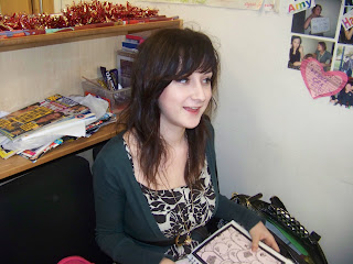
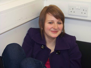
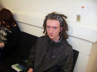
screen grab of a cutaway from our documentary
screen grab of a cutaway from Philip Pullman 'His Dark Materials' documentary
http://www.youtube.com/watch?v=5iHgbvmSeuI
I used cutaways to break up large segments of the interviews to make it entertaining. We also did this to cover the editing of questions we asked so this avoided jump cuts following the forms and coneventions of a typical mixed documentary allowing the audience to see an image or even create an image of interviewee is talking about.
Graphics:
screen grab of the use of graphics in our documentary
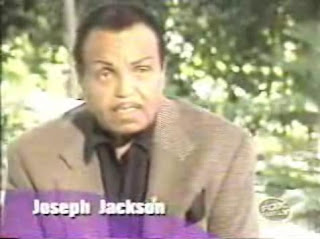
screen grab of the use of graphics from The Jackson family documentary
http://www.youtube.com/watch?v=LUmwTcf8r2A
Archive Material:I filmed a clip of the Lily Allen - Smile video from youtube to use as archive material in my documentary, when talking about the success of Lily Allen's Myspace page. Ialso filmed a clip off youtube of the bands Hippys on the Hill performing at a gig, and this was used as a cutaway during their interview.
Voice Over:We used a female voice over to follow the conventions of many famiy type documentarues. We found that a female would be stereotypical for this genre of documentary, as a female voice sounds like she is a giving a 'mothers' opinion about their childs safety and use of the internet, and we thought this would be appropriate to use in our documentary.
Music:
Question 2.How effective is the combination of your product and ancillary?The title is the same throughout:Print ad -
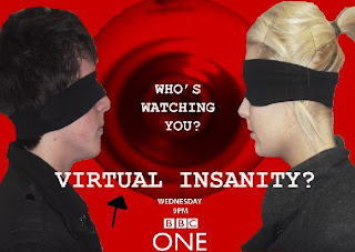
I added an arrow onto the print advert to highlight the title 'VIRTUAL INSANITY?'
Documentary -
Radio Trailor -
"virtual insanity"
Using a consistent title, it linked our print advert, radio trailor, and documentary together. On our print advert we made sure our title was the largest text as it would be able to stand out the most and the audience would instantly know what the title of the documentary was. The title is featured at the end of our radio trailor as this is the last thing the audience will hear and therefore are more likely to remember it.
Channel and scheduling: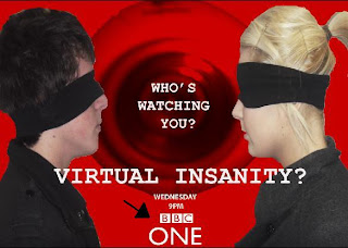
I added an arrow to show the channel and scheduling of our documentary.
The channel and scheduling for the radio trailor come after the title, and this is so that it is the very last thing the audience here and therefore will remember it.
Voiceovers:
The voice over in both our documentary and raido trailor are the same, and we did this as it follows the conventions of a typical family documentary which would be shown on BBC One.
Slogan:
I added an arrow to highlight where the slogan is.
Our slogan was 'Who's Watching You?' and we use this in our print advert and radio trailor which creates a coherance by linking them together. We chose this as the it acts as a question in which the audience can choose to think about, and as the audience is for adults we thought this would be suitable.
Style and Addressing the Audience:
Across our three products we create a coherance by encorporating the same style throughout. With the print advert we used a red background as this was a convention of BBC One, but it is also a colour which can be associated with danger which also anchors with the genre of our documentary. Our radio trailor's voiceover is quite formal and serious, and this is because the audience is for parents, however the song in the background is quite upbeat and we chose this as it would balance out our radio trailor. For our documentary we used this same formal voiceover as we did on the radio trailor, and therefore this approach created a coherance across all three projects.
Appeal to the Audience:
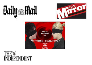
I created this picture to show which newspapers my print advert would be published in. I chose the Daily Mirror as young family mem bers who may want to watch the documentary might read this type of newspaper. I chose the Daily Mail as it is a popular tabloid newspaper and a lot of people may be likely to buy it, including members of our target audience. I chose The Independent as another newspaper as it addresses current issues and I believe that the genre of our documentary raises a popular issue which is talked about a lot on the news.
I created the above picture to show that The Times would be the main newspaper in which our print advert would be published. I chose this newspaper as it encorporates a lot of news and current issues, and as our documentary raises a popular issue i thought it would be appropriate to publish it in this particular newspaper.
The above picture indicates which radio stations my radio trailor will be broadcast on. They are all BBC stations as my documentary will be shown on BBC One, and I chose specific stations which would be suitable for my target audience of adults and parents.
Question 3.What have you learned from your audience feedback?We gathered a focus group consisting of 10 people together in class to look at all 3 of our productions, and we asked them certain questions to see their opinion on our products. After class I asked a few members of the focus group what their individual opinions where, and i took pictures and recordings of these.
After listening to my radio trailor and looking at my print advert, does it make you want to watch the documentary?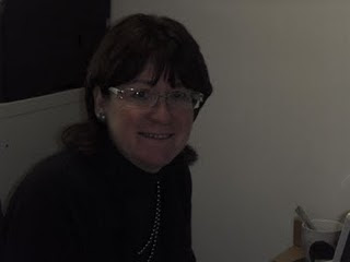
Sue Roberts aged 40
"yes it does because the clips of the documentary in the radio trailor make me wonder what else will be in the documentary. The print advert also makes me wonder what the documentary involves as it is not clear in the image."
Jenny Littler aged 20
Rebecca Hanson aged 17
In class, one person from the focus group said that the print advert didn't make it clear what the documentary was about as the main image was vague. However the other volunteers in our focus group said that yes they would watch our documentary.
Do you think the first 5 minutes of my documentary looks professional?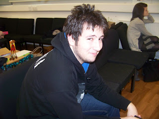
Tom Jackson aged 19
"Yeah I think it does, if I didn't know that you had made this i would of thought it was professionally done. I think it looks professional because of the use of music and images you collected which match the genre of the documentary."
James Johnson aged 18
When asking the focus group this question, 8 people said yes it does look professional, however there were 2 people who said that in some parts the documentary did not run smoothly, and this affected the professional quality of the product.
How do you think my documentary compares to other documentaries?
Christiana Oldrid aged 17
"the different music throughout goes really well with the genre and the topics being spoken about, and this also happens in professional documentaries."
Alice Eaton aged 18

Jenni Roberts
aged 16
"the cutaways during the interviews link the documentary together and make it look smoothly, and this compares to other documentaries because there are cutaways in professional documentaries too and they are used in the same way."
All of the people in the focus group said that it compares to other documentaries because of the cutaways and music. 4 people commented on the archive material and said that it helps he documentary look more professional, as it made it look like a real documentary.
How effective do you think our production is in terms of how entertaining it is?
Matthew Vaughn aged 19
"I think all 3 products are pretty effective. The image from the print advert makes you think about what the documentary is about, the clips from the documentary in the radio trailor make you want to find out more, and the actual documentary makes you want to carry on watching."
 Naomi Littler aged 17
"after watching the first 5 minutes of the documentary, i wanted to carry on watching to find out more. i thought it was very entertainig."
100% of the focus group thought that the documentary was entertaining.
Question 4. How did you use media technologies in the construction and research, planning and evaluation stages? 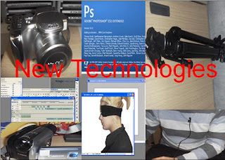


 Tom Jackson aged 19